While capturing some fall photos last month, I took a few generic shots of trees that I thought would look pretty cool just because of the colors. After looking them over and doing some editing, I was a bit underwhelmed. On one of them though, I tried messing around with the sharpness a bit. Specifically, I reduced the sharpness to make everything a bit blurry. I thought it looked pretty cool and tried to figure out a way that I could try to make the photo look as close to a Claude Monet painting. After thinking about it a bit and tweaking some of the creative options in Luminar I came up with this edit:
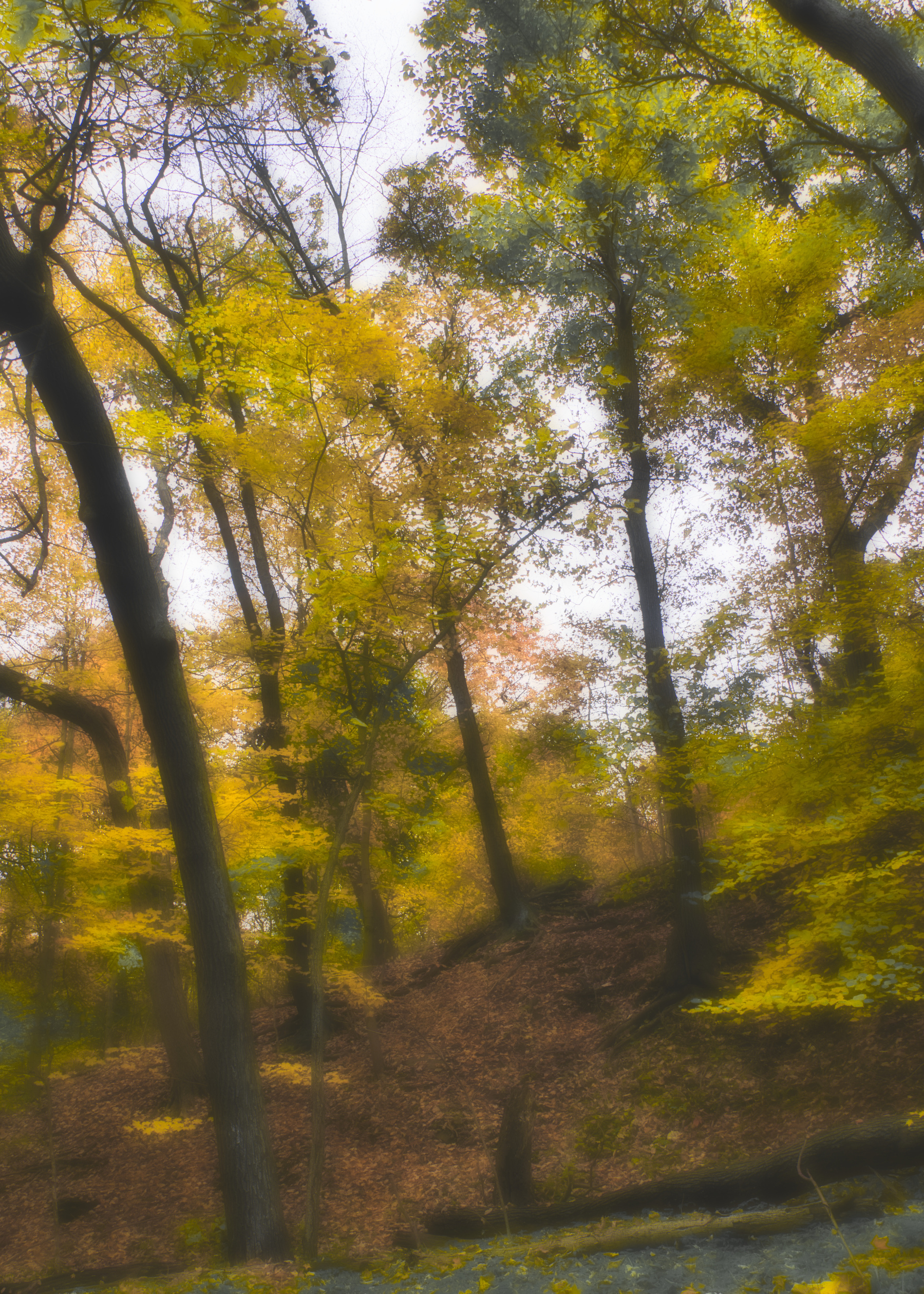
It might not look as much like a Monet painting as I wanted but I think it turned out pretty well. I tried out the same line of editing on a few others and was really surprised how well the effect worked for certain photos. Here are a few others that I think turned out pretty well.


